


about the project
*
about the project *
Topic: Exploring the use of branding in spatial design to create unique and identifiable spaces.
Abstract:
A spatial brand represents a distinctive identity that captures the essence, values, narrative, and offerings of a company through spatial dynamics, form, and functionality. While today's branding often gets pigeonholed into just logos, typography, and color palettes, it's much more expansive. Branding propels consumerism and economic activity, cultivates unique customer encounters, and can even shape how designers fashion recognizable spaces. This graduate-level research endeavor investigates how branding manifests in physical spaces and underscores the necessity for designers to weave branding into their design strategies and decision-making as an evidence-based design tactic. Branding communicates powerfully, and so do spaces. This study aims to clarify the significance of understanding and linking how built environments are shaped by branding, and conversely, how these environments can uplift branding, alongside how this interplay can be harnessed to craft unique experiences for consumers.
Project Proposal
1 Remodelled HQ Office: Using the exisitng Sleepyhead Office Floor Plan, the Researcher will create a fully remodeled Space, incorporating the brand into the exisitng space.
2. Pop-up Concept: Researcher proposes an approximately 100 sqft pop up concept that can travel between various universities, one being the University of Kansas. This Pop up will serve as a way of connecting students to the company and creating an interactive experience.
3. A Remodeled Store Front: This store shall be located in Downtown Lawrence, Kansas. It aims in utilizing an existing building and revitalizing it. This store design will not only focus on the incorporation of the brand in an existing space, but how it can be integrated with the existing urban fabric to both blend in and keep true to its brand.
about the project
*
about the project *
The Research Question:
What is the role of Branding in Spatial Design? What techniques/ methods are used to successfully implement a brand guideline into physical spaces? How to create a unique identity of spaces that create an experiential impact for consumers?
Project Background
For this project, student Dianejili seized the chance to examine and assess the relationship and influence of branding on architecture, using the Sleepy Head USA brand guidelines as a foundational tool to dive into the research question. The primary goal of the project is to create and design three distinct spaces that draw from a single company's brand guidelines as their design framework. In this endeavor, the researcher will investigate how to weave specific brand elements into the diverse spaces while tailoring the designs to their unique functions, locations, sizes, and project categories.


Meet Sleepy Head USA and CEO Steven Van Alen
Sleepyhead, founded by CEO Steven Van Alan, is the quintessential mattress topper company hailing from the sunny state of Arizona. Tailored specifically for college students, Sleepyhead was born out of a simple yet powerful realization: a great education is anchored in a restful night's sleep. During his collegiate journey, Steven experienced the trials of dormitory life and the discomfort of subpar mattresses. This inspired him to create Sleepyhead, where
each mattress topper is crafted to transform those lumpy, unfriendly surfaces into sleepy sanctuaries.
Designed for the unique needs of students living in dorms and pre-furnished apartments, Sleepyhead offers a range of thicknesses, sizes, and compositions. While it caters specifically to the student demographic, its versatility ensures that anyone yearning for a cozy upgrade can benefit. With Sleepyhead, sweet dreams are just a topper away!

Brand Guidelines and Elements
*
Brand Guidelines and Elements *


Finally, an excuse not to make your bed.
Sleep 101: Now in Session.
New Bed. New You.
Rise feeling rested and shine on.
Catch more dreams.
Sleep vibes only.
No bad nights.
Cuz you can’t sleep when you’re dead.
Make Bed time the best time.
Dream Therapy, now in session.
Practice safe sleep.
Count less sheep. clock more sleep.
Perfect for both night owls and early birds.
Your bed deserves a cherry on top.


Brand Guidelines and Elements
*
Brand Guidelines and Elements *

Part 1
*
Part 1 *
The Office
*
The Office *
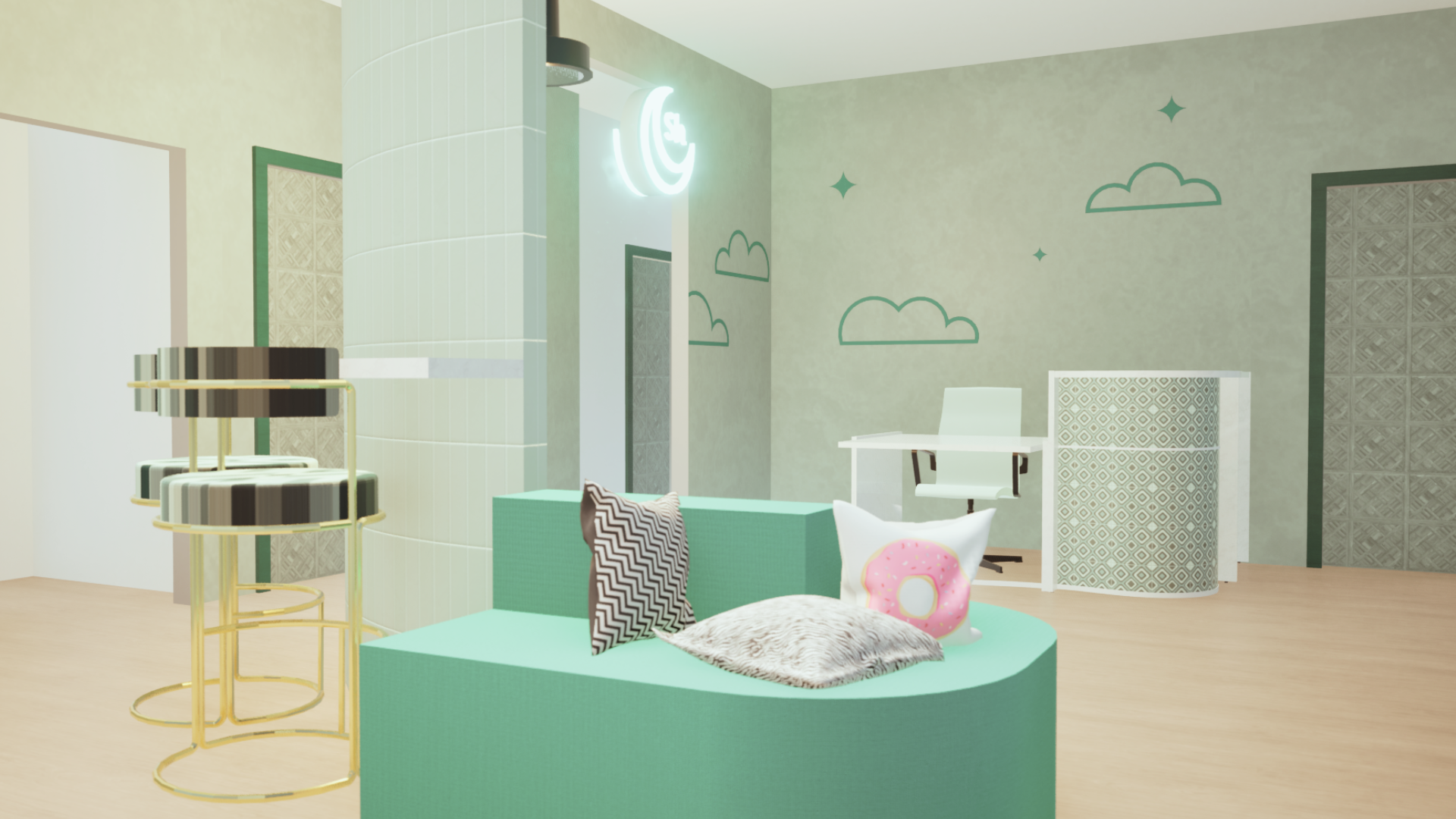
Address: 6934 E 5th Ave Scottsdale, AZ 85251.
The Following space is the current head office of Sleepyhead USA. This space, not only houses the executive staff of the company, but also the marketing team. This space should not only be used as a formal office space, but also a space for employees to be creative, work both independently and dependently. The space should blend both a traditional office setting and open interactive spaces. Being the headquarter of the company, this space should create a feeling of home and embody different elements of the brand.


1. The offices; are existing rooms from the original floor Plan. The Floor plan features a total of 5 traditional offices. These offices can be assigned to employees or work as floating offices, to be reserved as needed, or a combination of the both.
2. The lounge; is a small open space, tucked between two offices. It is meant to be a quiet space for relaxation or brainstorming some ideas.
3. The Bathrooms (etr.)
4. Receptionist
5. The Content Room; will be modelled after a bedroom, featuring a bed, desk, and closet. This room can be used for content creation or a spare office/ Marketing office.
6. The Kitchen; as been expanded from it original size and is now accessible from both sides of the office.
7. The SemiPrivate Seating; is an area that is blocked off from the main bullpen to offer another area of seating.
8. The Conference Room; is existing to remain, with it’s orginal door placement changed. The Conference room is able to be opened up into the semiprivate seating area.
9. The Print Room; is a closet that would store office supplies, printers and other machines.
10. The Bullpen; is meant to be an untraditional take on the traditional cubicle farm. employees work mainly from their laptops, this office space also them to move around throughout the day as the feel please. If employees desire privacy, a office may be reserved or utilized.


Part 1
*
Part 1 *
The Office
*
The Office *
Part 2
*
Part 2 *
The Store Front
*
The Store Front *
Address: 916 1/2 Massachusetts Street, Lawrence, Kansas, 66046.
The following Store Front is located in Downtown Lawrence, Kansas. When proposing this project, the research wanted to test the concept of a sleepyhead, physical store, as Sleepyhead currently has none. The following store front is currently unused and is approximately 24 ft wide by 110 ft long. This section of the project will propose how a potential store front, in a college town would look on the exterior, in addition to a partial potential floor plan and Topper Display.

Store Front Concepts
Concept 1: Branding Elements + Window Display
This first concept would be simple, cleaning up the existing store front, keeping the original colour of the building and exposed bricks. To the Exterior of the building a new canopy would be added along with the medallion, and a potential opening window display.

Concept 2: Updating the building colour
Throughout downtown Mass Street, you can find an array of building featuring brown toned buildings in addition to light and pastel colours. The Buildings directly next to this store is white painted brick and to the other side a whitewashed brick finished. Adding a white finish to the building can drastically change the feel of the building.
The concept features the fully painted white building, from the EIFS Above to the Brick on the Street Level.


Store Front Elements

Design Element 1: Drapery
The Drapery element is simple addition to the store front to help with minimizing direct view into the store during constructions, at nights, etc. It is a temporary element that can be removed as seen fit, as well as to create a solid backdrop for future window displays.
Design Element 2: Floating Feathers
The Feathers were brought into the window display to create depth, cast shadows and add overall visual interests in the display. the feathers are taken from the pattern printed on the cover of each mattress topper.
Design Element 3: Potential Window Display Signage
To help with the announcement of the store, simple banners are always useful. Keeping the banners simple and on brand, it is easy to read and make a simple connection to the brand through the colour of the text, font and Sample Messaging.
While the simple banner taking up most of the store front visibility into the store, it creates curiosity ahead of the grand opening and unveiling.

Design Element 4: Canopy Options
The Following are four various options for canopy designs that can be used on the building. Some without the sleepyhead name and some with
Design Element 5: Sample Messaging
The following sample messaging are easy to incorporate in a simple way, whether it may be a large sign on the wall, to a small gesture found on a canopy. using and displaying small sayings as such help to increase rememberability of the brand.
Design Element 6: The Medallion
The medallion of the owl is a small but important part of the brand, like the brand messages. The medallion contains the main brand logo within it and can also be found within the printed illustration of the box in which the topper arrives in. Putting at eye level, on a busy pedestrian walkway will help to increase brand visibility.
Bonus Interior Concept
*
Bonus Interior Concept *
Given that the following store front will not be used to as a typical retail store, but instead a dsplay store, there will be atleast half of the store space available for a secondary business or marketing collaboration. The store’s main goal is to act as a way for potential customers to try the mattress topper before making a purchase. As such the main feature of the store would be the three various displays for the corresponding toppers.
A potential Secondary business in which Sleepyhead can combine to the store is an ice cream shop.
Why an Ice - cream Shop?
From the pastel colour palette to the slogans, such a “your bed deserves a cherry on top.” It creates the perfect atmosphere for the combination.
The Floorplan

The Display Concepts


Decorative ceiling display, to host the name of the mattress topper.
Curtains, to in a darker shade to the associated colour of the mattress topper.
Wall mural, associated with the colours of the individual mattress topper.
Mattress Topper, along with bed frame and mattress.
Carpet, Continuing the colour scheme from the ceiling to the floor.
Bonus Interior Concept
*
Bonus Interior Concept *
Displays for the 3 toppers currently offered, in a segmented area, through the use of colour, The Instore colour connection to the individual Topper type corresponds with the online display for each topper.
Window Display
Second floor tenants, entry and staircase.
The secondary sales area in the store is would not be utilized as a sales area, as this store is not meant to carry any merchandise. this space could potentially house seating while Ice Cream is served through an opening in the back wall.
Back of House Area.

